Field Types
The full list of field types available in Form Plant. Add fields with + Add Field on the Fields tab — field types are picked from an icon grid.
The Field Editor
Each field expands in place as an accordion, organized into three tabs.
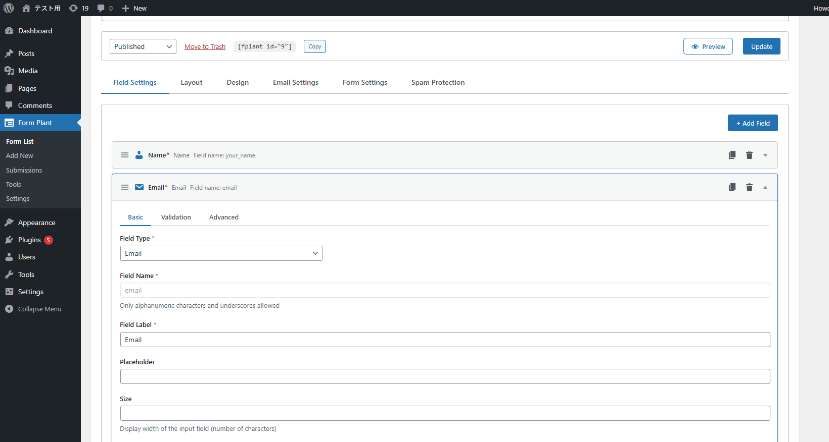
| Tab | Settings |
|---|---|
| Basic | Field type, field name, label, placeholder, choices, and other type-specific settings |
| Validation | Required, length limits, custom error messages |
| Advanced | Descriptions (3 positions), custom ID / class |
Basic Fields
| Type | Use | Key Settings |
|---|---|---|
| Text | Single-line free input | Required, max length, placeholder |
| Textarea | Multi-line input | Required, rows, max length |
| Email address | Required, automatic validation | |
| Phone | Phone number | Required, hyphen handling |
| Number | Numeric input | Required, min/max |
| URL | URL input | Required, URL format check |
| Password | Password input | Optional strength meter |
| Hidden | URL params or fixed values | Default value |
Name and Address Fields
| Type | Use | Notes |
|---|---|---|
| Name (parts) | Last name / first name as separate inputs | Per-part required and custom error messages |
| Name (Kana) | Furigana parts (Sei / Mei) | Katakana validation, per-part settings |
| Postal Code | Japanese 7-digit postal code | Address auto-fill via zipcloud API |
| Address (Japan) | Prefecture / city / town / street | Auto-filled by postal code |
| Address (international) | International address format | With country code |
| Prefecture | Japanese prefecture dropdown | All 47 prefectures built in |
Date and Time Fields
| Type | Use |
|---|---|
| Date (Calendar) | Pick from calendar UI |
| Date (Dropdown) | Year/month/day dropdowns |
| Time | Hour:minute dropdowns |
Choice Fields
| Type | Use |
|---|---|
| Select | Choose one option from a dropdown |
| Checkbox | Multiple selection |
| Radio | Single selection |
Special Fields
| Type | Use | Notes |
|---|---|---|
| Acceptance | Consent checkbox for privacy policies etc. | Always required. See below |
| File Upload | Attach files | Configurable size and type restrictions |
| HTML | Static HTML content | Display only, not an input |
Field types added by Pro
Installing Form Plant Pro adds these field types.
| Type | Purpose | Details |
|---|---|---|
| Field Group | Combines several fields into one set | Field Groups and Repeaters |
| Repeater | Repeats a set of fields as rows visitors can add and remove | Field Groups and Repeaters |
| Page Break | Splits the form into pages | Multi-step Forms |
Pro also adds a Conditions tab to every field, for showing or hiding it based on other answers (Conditional Logic).
Acceptance field (privacy policy consent)
A dedicated field for privacy policy / terms of service consent (added in v1.4.0). It renders a single checkbox with a linked consent text, and the form cannot be submitted without checking it (the field is always required — this cannot be turned off).
Settings
| Setting | Description | Default |
|---|---|---|
| Label | The field's item name (plain text) | — |
| Consent text | The wording shown next to the checkbox. Limited HTML is allowed (see below). When empty, the label is shown instead | empty |
| Show label on the form | Show the item-name label separately from the consent text | off |
| Show on confirmation screen | Add an "Agreed" row to the confirmation screen | off |
| Include in emails | Add an "Agreed" line to the field list in notification emails | off |
| Store in submission data | Record the consent in the stored submission | off |
| Validation message | Error message shown when submitted unchecked | "You must agree before submitting." |
All four display / storage options default to off, but the required check always applies.
Writing the consent text
The consent text accepts these HTML tags: <a> (href / target / rel), <strong>, <em>, <br>
I agree to the <a href="/privacy-policy/" target="_blank">privacy policy</a>
With target="_blank" the link opens in a new tab, so the visitor's form input is preserved.
Consent records
With "Store in submission data" enabled, the submission records the checked state together with a snapshot of the consent wording (text and link URLs) at the time of submission. Even after you later edit your policy wording, the submission detail screen shows exactly what the user agreed to.
Common Settings
All fields support:
- Label — Text shown above the input
- Field Name — Internal identifier, used for HTML template tags and email merge tags (e.g.
{Name}) - Required — Mark as required
- Placeholder — Faded hint text
- Descriptions (3 positions) — On the Advanced tab, show helper text below the label, above the input, and below the input. HTML tags such as links and bold are allowed. Text color and size are adjustable in Design Adjustments
- Custom ID / Custom Class — On the Advanced tab, add an arbitrary ID / CSS class to the field
- Default Value — Pre-filled value
- Custom validation messages — Custom messages for required / format errors
Need More Control?
- Want to change colors, sizes, or spacing? See Design Adjustments
- Want to fully rewrite the layout? See HTML Template
- Want custom validators? Use the JavaScript hook API (
window.fplant.addValidator)